


If you’re a frequent House Enthusiast reader, then you’ve heard me sing the praises of C2 Paint before. Their “Magnet” color is one of my favorites. Depending where and how you use it, it can be deep and striking, liquid and soft, or stony and subtle. On the fireplace surround above at the KHS Harvard Shaker House renovation/addition, it tends toward the deep and striking, boldly contrasting the putty grey (C2 “Pavement”) floor.

“Magnet” on the floor of the KHS Shaker House renovation/addition
Elsewhere, in the same KHS project, C2 “Magnet” makes an appearance as a floor paint. Here, it comes across as more liquid and soft, especially where it juxtaposes the C2 “Sheer” cabinetry and trim. Using a limited palette of colors — sometimes in different applications — can help rooms of a smaller home flow one into the other to create an overall more spacious effect (as I mention in The New Small House and The New Cottage).
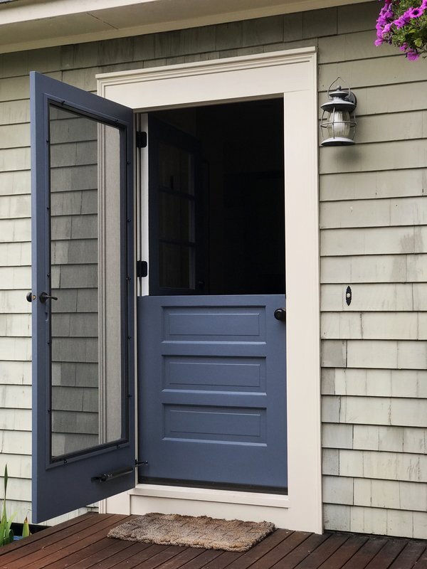
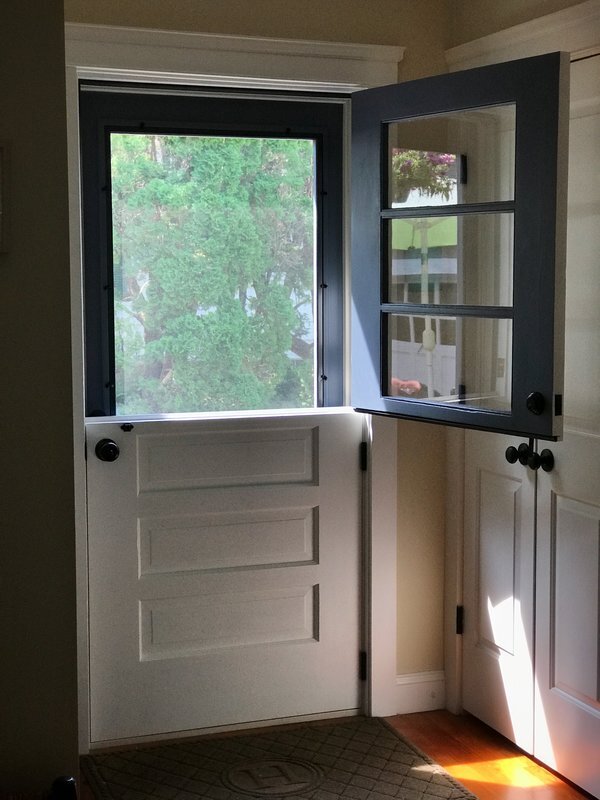
At our own cottage, C2 “Magnet” on the screen door and Dutch door (which I had modified from an existing stored door) takes on yet another tone. It has more of a stony subtle flavor in an exterior application. I wrote about this Dutch door in an earlier House Enthusiast post.
As with any paint color you’re considering, you’ll want to look at a sample of it in different qualities of light and in different orientations (vertical or horizontal) to get an idea of how it will look in relation to the other surfaces where you plan to feature it. Fortunately, C2 offers poster-board-size samples to help you make a decision.
Now, go forth with color confidence. You’ll be glad you did.
by Katie Hutchison for House Enthusiast