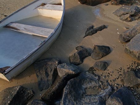
 Click on this photo to see it in the KHS photo note cards/prints gallery.I imagine most folks associate Martha's Vineyard with summer. Not me. It’s a favorite winter place. It’s quiet then, rugged and achingly beautiful. When I came upon this frozen dinghy, cozying up to some rocks in Lobsterville, I was reminded why I’m so taken with the Vineyard this time of year.
Brimming with ice, the boat was parked almost as firmly on the beach as the dark, worn rocks it had chosen for company. Frozen water had found level in the old beached vessel. A pattern of lapping waves in the sand swirled around the boat’s bowed sides and neighboring rounded rocks. By contrast, the square edges of the boat’s seats betrayed our often orthogonal constructs. The combination of curves, both natural and man-made, and straight or level surfaces, both natural and man-made, transfixed me.
When I look at this photo today, it seems a model of sympathetic site design. I will tuck it away in my visual memory to tap into when pondering how to create a future site design in which a human intervention resonates with its natural environment.
by Katie Hutchison for the House Enthusiast

