Kids summer camp architecture workshop

This House Enthusiast visited a local summer camp yesterday to present an architecture workshop. My hope, of course, was to inspire future house enthusiasts in the joys of the creative process.

Twenty plus campers ranging in age from preschool to high school joined me in talking about what architecture is, what it's made out of, and what an architectural scale model is. Then, I introduced them to their project for the morning: to imagine a place to read and to construct a scale model of it out of sustainable materials that I provided.

Each camper received a brown goodie bag containing a 6" x 12" thin piece of cork, four wooden plant-labeling sticks, four bamboo toothpicks, and a 2" x 6" piece of moss ribbon. We talked about the properties of each material, including the brown paper bag, and what each might represent in their models. For the sake of scale, I suggested that the length of a plant-label stick represents eight feet in the real world, which amounts to 3/4"=1'-0" scale. And then the campers launched into design and construction of their imagined places to read.

Much of the fun for me was when I got to play the supportive Tim Gunn role and visit the campers mid process to discuss and occasionally advise them on next steps. Naturally, I was very impressed with the kids' resourcefulness and good will. Here are some of them with their creations, and some close-ups of their scale-models of a place to read.

by Katie Hutchison for House Enthusiast


Design snapshot: Three-sided room/porch

Architects love designing spaces that can be transformed from one use and feel into another use and feel, and, if possible, into yet another use and feel. This three-sided room/porch is a great example why. Close all of the sliding glass doors and enjoy a bright room at the end of the house. Open them all most of the way and experience the outdoors indoors. Open a pair on one side only, and feel the nuance of prospect from within partial enclosure.

The continuity of flooring material and level indoors and out, the wicker furnishings, and pale blue ceiling color enhance the indoor/outdoor vibe of this space. Is it a room or a porch or both? It's the ambiguity that's so engaging, as is the attention to detail in the flanking windows, basket-weave brick flooring, and rafter-tail overhang.

by Katie Hutchison for House Enthusiast

Web tour: Cottage, cabin, converted Airstream, and more

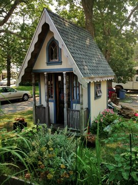
Lately, I've been stumbling upon some of my best finds while looking for something else. Such was the case when I came upon this tiny cottage in Oak Bluffs while en route to the annual Cottagers Cottage Tour. The gothic-revival steep roof, peaked-arch window, carved barge boards, mini porch, and delicate foundation plantings are all a delight. Which got me thinking, 'tis the season for back-to-basics living. Time to enjoy playhouses, cabins in the woods, and camping trailers (and, of course, garage/garden rooms like this KHS design in Manchester, Mass.).

Get started with the July/August 2013 issue of Design New England which features an intriguing grouping of four new getaway cabins on Sebago Lake in Maine. With vaulted standing-seam copper roofs, fieldstone foundations, and cedar siding, the warm-tone cabins appear to grow naturally from the site, peacefully nestled between rock outcroppings and trees along the lake's edge.

Head over to Sunset online to find a young, landscape architect's Airstream trailer converted to home and his accessory trailer rendered portable office. His unique and creative housing/office choices are sure to inspire.

Pick up the HOUSES 2013 issue of Fine Homebuilding to read Sean Groom's article about accessory dwelling units (ADUs) in the Pacific Northwest. These buildings and spaces, which are smaller than 800 square feet, accommodate a whole host of uses often better than conventional alternatives. It's high time that financing and zoning regulations friendly to ADUs are more readily adopted in New England, too. (Also check out Michael Litchfield's In-laws, Outlaws, and Granny Flats: Your Guide to Turning One House into Two Homes.)

Let these back-to-basics accommodations inform your getaway, office, guest quarters, granny-flat and home. It's summertime and living should be easy.

by Katie Hutchison for House Enthusiast

Design snapshot: Hardscape footwork

Architects and designers orchestrate movement through space, both inside and outside the home. It's one of our great challenges. As frequent House Enthusiast readers might recall, I believe most any and all constructed space is architecture, including the patio, garden, driveway, footpath, tool shed, etc. That's part of the reason I enjoy the temperate months; they allow me to explore the architecture beyond our homes' walls.

This space in between -- in between inside and outside, in between house and fence, in between porch and garden -- beautifully steers visitors and occupants as they transition from street arrival to private home and onward.

I'm particularly enamored with the random-sized and random-coursed slate pavers set on an angle that intermingle with brick, and create a jagged border of grass and plantings along a curved, stone-edged, raised bed on one side and a slightly elevated brick and granite porch patio on the other. The organic yet intricate footpath reminds me of my teen figure-skating days. On a small plan sketch of the rink, my coach would choreograph where each spin and jump in my freeskate programs would occur, and I would invariably ask, "But how will I get there: from camel spin to lutz?"  Her answer, "With footwork." Indeed, it's inspired hardscape footwork that brings folks arriving at this home from feature to feature.

The contrast of color, texture, angle, even elevation enrich the experience of this procession, giving clues that both orient and delight. The footwork is as intriguing as the highlights along the way.

by Katie Hutchison for House Enthusiast

Design snapshot: Vertical garden

I saw my first vertical garden in California. There, tackling the vertical surface seemed the next logical step in zone-14 garden evolution. Little did I imagine, it was an idea readily adaptable to our hardier clime. Avant Gardens of N. Dartmouth, Mass. has figured out how. Follow this link for their hardy, drought-resistant, succulent, vertical-garden how-to.

I snapped this shot of their vertical garden in situ on their garage. Naturally, the garden planting itself required design savvy, but so too did the size, fabrication, orientation, and placement of the vertical garden. The cedar garden surround in a width similar to the cedar coursing helps "ground" the box, and the proportion beautifully echoes the proportion of the door panels and lites. The colors work together brilliantly, too.

Having attended the vertical garden demonstration at Avant Gardens this past weekend, I now also understand that vertical-garden size is critical; the larger the box, the heavier and the more unwieldy to mount and maintain.

I'm dreaming up a few of these beauts for my south-facing side wall. Time to start acquiring succulents. So far, I have one. It'll be a while...

by Katie Hutchison for House Enthusiast